Brand identity
Nordlys Coffee
An identity and packaging system for an Aarhus roaster, built around the warm light of a northern morning.
- Client
- Nordlys Coffee Roasters
- Year
- 2026
- Role
- Creative direction and design
- Services
- Brand strategy
- Visual identity
- Packaging
- Signage
Case study
The brief
Nordlys started as a two-person roastery in an Aarhus courtyard and grew faster than its look could keep up with. Every bag was hand-stamped, every café menu was improvised, and the founders wanted a system that could scale to twelve single origins without losing the small-batch feeling their regulars loved.
The approach
We spent the first week at the roastery, watching how coffee actually moves from green sacks to finished bags. That shaped everything: a wordmark cut from the curve of the roasting drum, a palette taken from the colour of beans at first crack, and a labelling grid that lets the team print new origins in-house the same morning.
- A flexible wordmark and monogram that work from a 12 mm stamp to a café façade
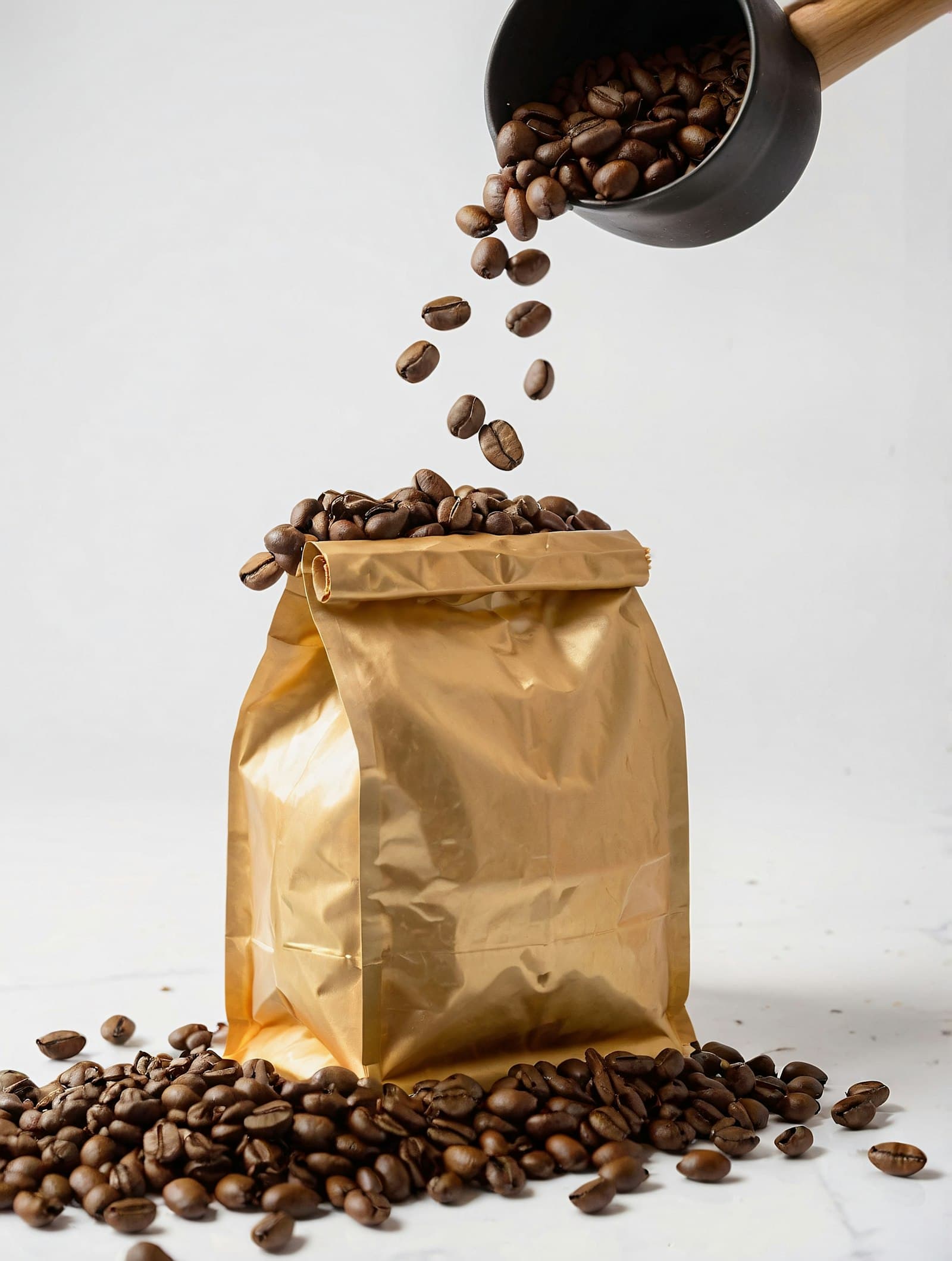
- Gold-foil bags with a modular label system for seasonal and single-origin lines
- Menu boards, cups and signage for the first Nordlys café
The outcome
The new packaging launched with the spring harvest. Wholesale enquiries doubled within six months, and the team now designs limited releases themselves using the label templates, without waiting on a designer.
“Elin understood that our brand had to feel handmade even when it was printed by the thousand. She found that balance faster than we did.”
Co-founder, Nordlys Coffee Roasters