Web & digital
Halden Architects
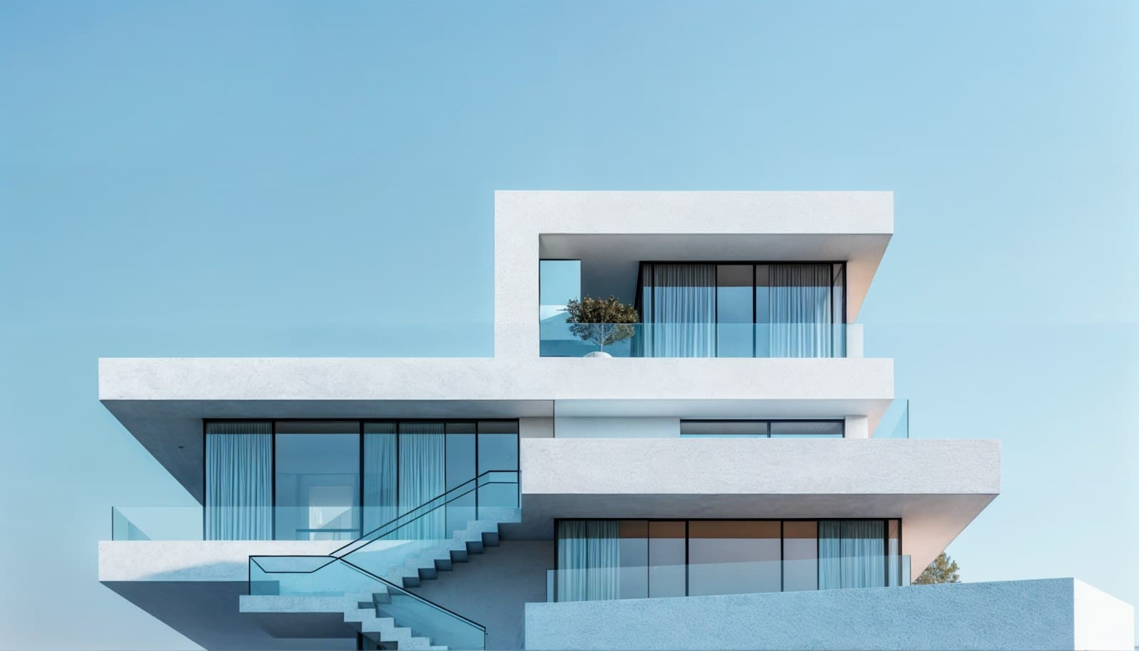
A calm, image-led website for an Oslo practice whose buildings needed room to speak for themselves.
- Client
- Halden Arkitekter
- Year
- 2025
- Role
- Art direction, UX and UI design
- Services
- Website design
- Art direction
- Content strategy
- Design system
Case study
The brief
Halden had twenty years of award-winning residential work and a website that buried it under menus, sliders and press logos. They wanted a site that felt like walking through one of their houses: quiet, generous with space, and full of light.
The approach
I stripped the structure back to the three things visitors actually came for: the projects, the people and a way to get in touch. Each project page follows the rhythm of a site visit, opening wide on the exterior and moving in towards details and materials, with captions written by the architects themselves.
- A modular project template the studio updates without a developer
- A restrained type system pairing a classic serif with generous white space
- Image guidelines for photographers, from crop ratios to colour grading
The outcome
Average time on project pages tripled after launch, and the studio credits the new site with two of its largest commissions this year. The design system has since been extended to their printed monographs.