Editorial
Margin Quarterly
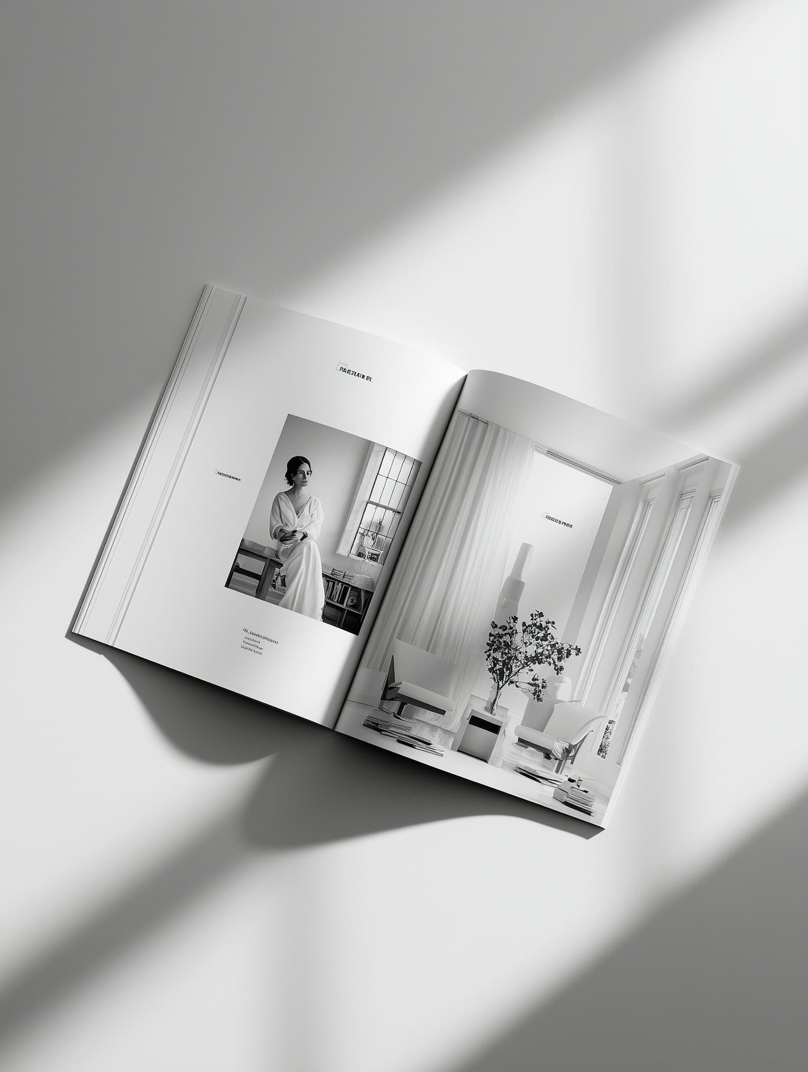
A redesign of an independent arts and culture magazine, giving long reads and photography equal weight.
- Client
- Margin Publishing
- Year
- 2024
- Role
- Art direction and editorial design
- Services
- Editorial design
- Art direction
- Typography
- Print production
Case study
The brief
After eight years in print, Margin had collected three different grids, a dozen typefaces and a cover that changed every issue. The editors asked for a redesign that would feel unmistakably theirs on a crowded newsstand while giving writers and photographers more room.
The approach
We built the new Margin around a single twelve-column grid and two typefaces, then spent most of our time on the white space between them. Long reads open with a full spread of photography, essays run in a wide single column, and a slim reviews section closes each issue with a denser, newspaper-like rhythm.
- A cover system built on one constant masthead and a rotating photographic crop
- Templates for features, essays, interviews and reviews
- Paper and print specifications developed with a Copenhagen printer
The outcome
The redesigned issue sold out its first print run in three weeks, and Margin was shortlisted for a Nordic editorial design prize the following spring.